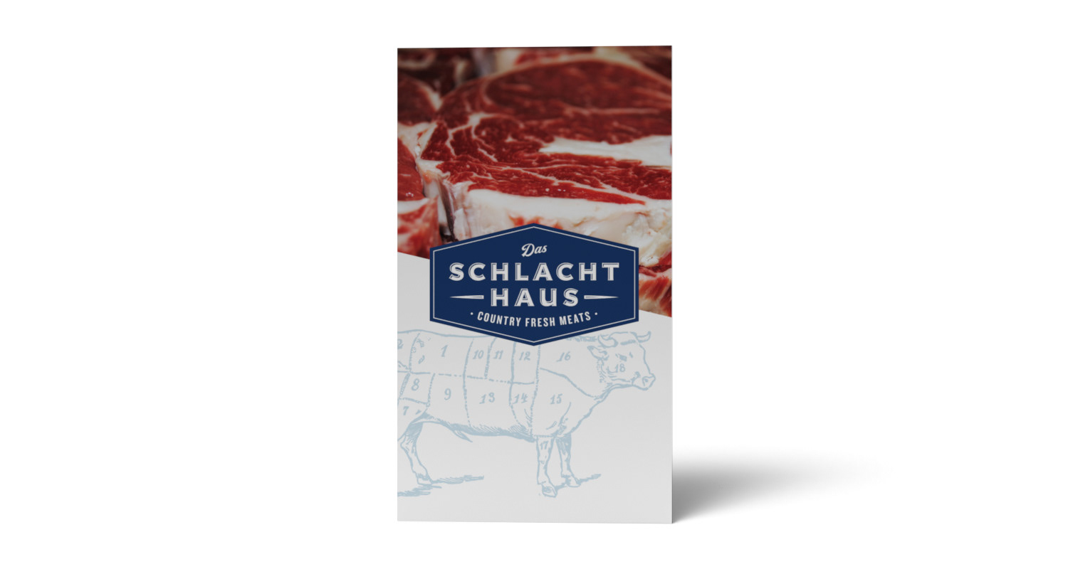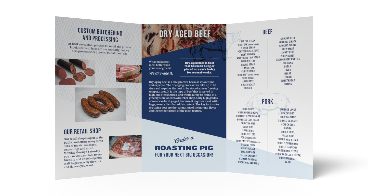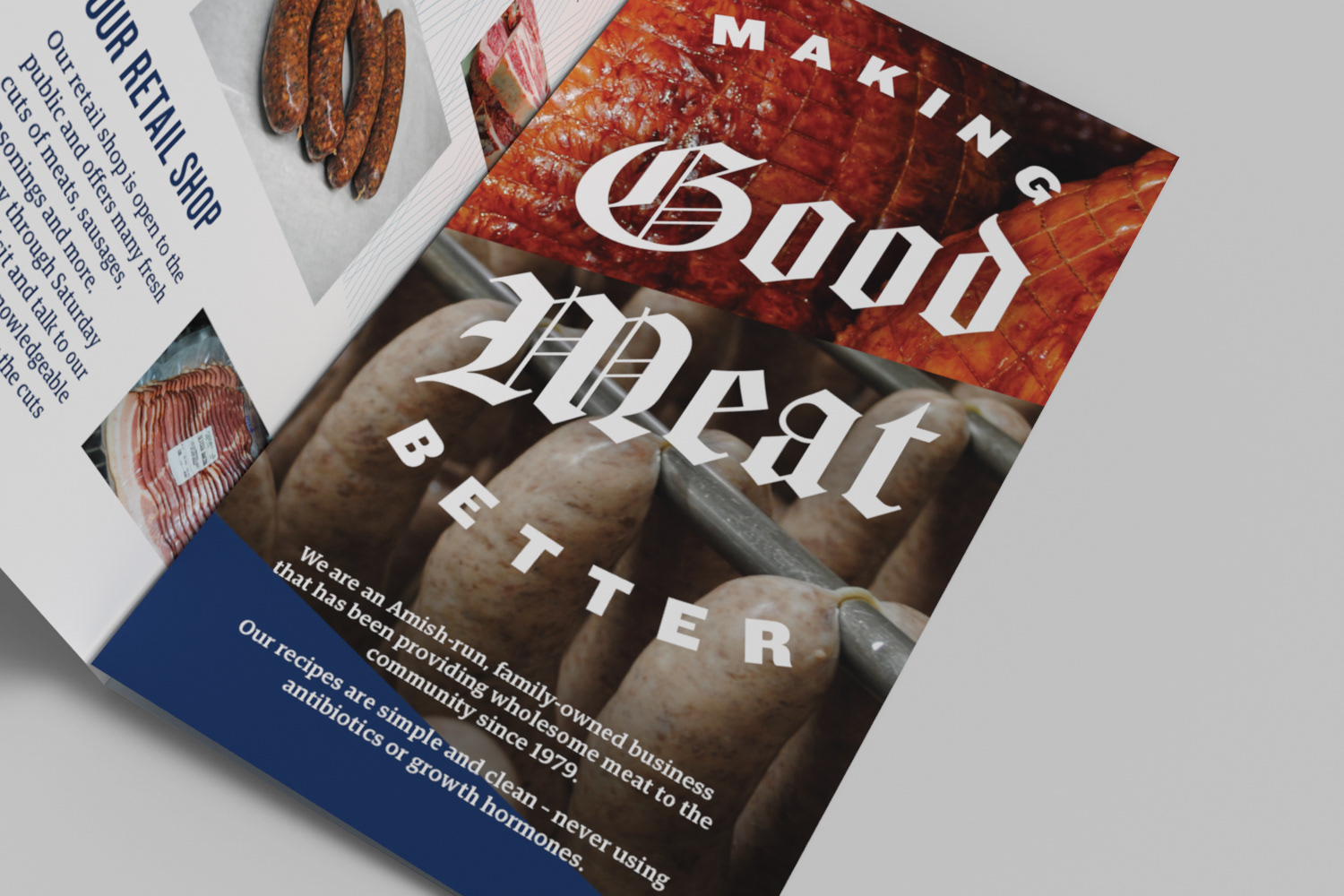

Logo and brochure design for Das Schlacht Haus (German for The Slaughterhouse), which is an Amish-run, family-owned butcher shop that provides custom processed meat for retail and private label.
APPROACH
Traditional and historic design guided the color and creative choices. To keep from looking
dated, I used imagery with sharp, diagonal lines, which also representing cutting/slicing. I used a simple blue and white color palette – blue to symbolize the company value of trust, loyalty, and faith and white to reflect the clean and sanitary environment of the shop.
dated, I used imagery with sharp, diagonal lines, which also representing cutting/slicing. I used a simple blue and white color palette – blue to symbolize the company value of trust, loyalty, and faith and white to reflect the clean and sanitary environment of the shop.